This week Sally is asking us to look at the written word,
to look at fonts, are some more pleasing than others?
Do some draw you in?
Small confession - I was at Barnes and Noble this weekend....
I immediately pulled out my iPhone and took a few
shots. I love all the different fonts - from
children's books to magazines.
The color, size, lines.
All intriguing.
The shapes
The use of color in the font
Quite possibly my favorite!
The depth and feeling
I love the jagged lines in the title
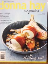
The shots of food are simply stunning!!!
(Had to buy this one, great recipes)
Please visit Sally's blog to see what other
wonderful typography others found.


21 comments:
Book covers are an endless source of design goodies.
Not sure why taking photographs of books didn't occure to me... I had signs on the brain! I can spend hours in book stores!
I miss Barnes & Noble and Borders, and independent bookshops even more... Glad you still have your branch. Perfect for this week's prompt, too!
Have a wonderful week :)
This was the first thing I thought of doing too LOL! I'm a voracious reader and am sometimes amazed how a book's cover will affect my perception of what's within.
Courtney you did a great job of showing typography. Fancy Nancy was my favorite.
Your picked some great typography to photo. Each one so represented the title.
like getting full permission to judge the book just by it's cover! Great shots, I'm with you on the mustache baby that is a crack up!
Wow you were surrounded by inspiration! I like mustache baby too!
Cool looking books- that Mustache Baby looks like some fun!
Courtney, what a great idea! The examples you've snapped for us are really interesting - and what a variety! So much goes in to the font chosen for a book cover. It conveys so much. I wrestled with this a bit with my upcoming book - the font chosen for the title was not what I had in mind at all. It is growing on me though, and it has helped me to consider font choices out of my ordinary realm.
Zack reads these books that are filled with font changes and color changes...Geronimo Stilton (he's a mouse). I love them because the author captures the very feeling of a word with font and color she picks.
You really captured some great fonts and I love the way the picture complimented the fonts! Madison Avenue at its best!
you are so right! book covers have so many gorgeous fonts! how cute is the baby mustache one you've got here!
Book stores are danger zones for me; even with books shelves that are overflowing.
Now I have to go look up Mustache Baby....did baby have too many hormones? lol
Wow, you picked a great and varied selection of text - I love the Mustache baby with the curly bits on either end of the text!
It's always fun to visit a book store, and I'll bet it was even more fun to snap these wonderful font styles.
The donna hay magazine looks like one I might need to grab next time I'm there.
Great photos!!
That baby and font is adorable! That person is very talented with typography. I should play around more with fonts I think.
Wonderful dependable books. The are so inspiring.
Sweet and wonderful!
Oh - great place for typography! I love to sneak away to B&N for some 'alone' time w/books and magazines and a great cup of coffee!! It's like the library on steroids! Kids books are priceless in my opinion w/their lovely fonts and designs - so much fun! Great pots.
Post a Comment